Purpose: Why This?
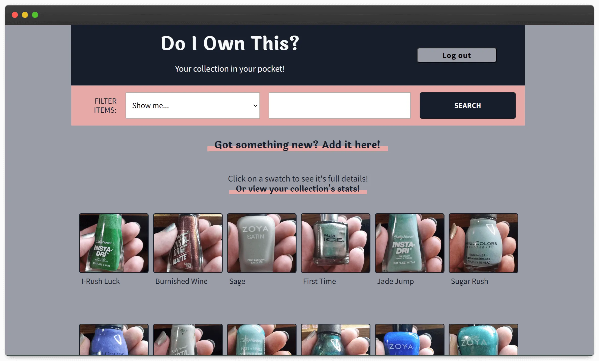
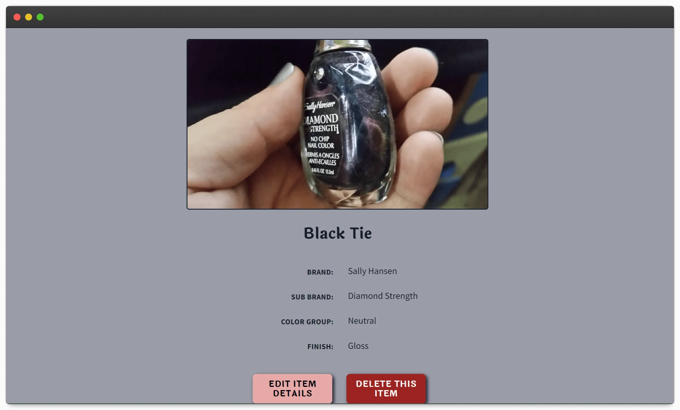
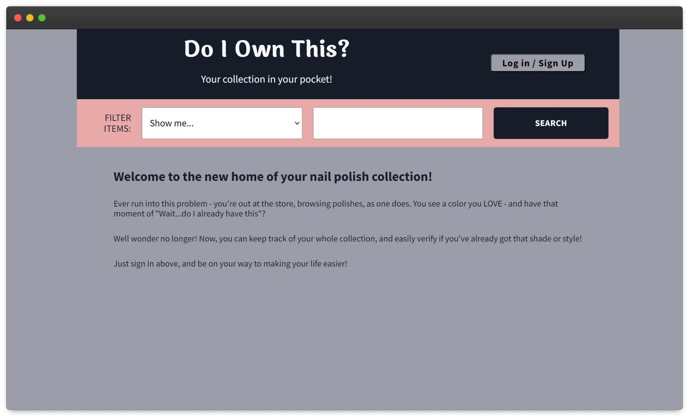
I made this site for two reasons - I'd always wanted it to exist, and it was time to learn a framework. I have over 100 nail polishes, and it's easy for me to forget what shades I already have when I'm out browsing at a store. I'd long dreamed of having a site where I could catalog my collection, so I could easily see what I have. After doing a bit of research, I decided to start my framework journey with Vue. I loved that it was open-source, and it felt like a nice mix of the best things from React and Angular. It was also listed multiple times as a nice choice for someone new to frameworks to work with, which sounded perfect.
Highlights: The Good Parts
- Styling this site was incredibly fun. I spent a long time testing colors for contrast against each other, ensuring they'd meet the WCAG standards. I'm especially proud of the link styling - on hover, the color highlight increases to cover more of the word. It's a visually appealing trick I picked up and slightly modified from Monica Powell.
- Working with Firebase as a database was surprisingly smooth. The syntax was straightforward, and somehow it...just worked? It still mildly amazes me that it was so simple to get working and that there were very few issues with storing and fetching the data. Knowing this site would need a reliable database, Firebase has been an excellent choice!


Challenges: The Hard Parts
- The other draw to using Firebase was that it included an authentication option. However, I quickly ran into problems with social authentication. Somewhere along the way, any attempts to use a different account would log me into the original account. Ultimately, I turned the social authentication off and switched to the email and password flow, which has worked reliably. However, it also forces the user to create a new account, which isn't ideal.
- My other big hurdle was learning how to manage state. In tutorials, this seemed like it should just work, but I quickly learned that wasn't the case. At one point, I got so frustrated I had to take a break for a few days and come back to it with fresh eyes. I watched a more in-depth tutorial series on working with Vuex and completely rewrote my state files. With these updated files, I was able to get my data passing much more reliably between pages. There's still a lot that doesn't quite click for me with this topic, but I've come a long way!
Takeaway: Lessons Learned
I gave myself a timeline of one month to build this project, which was a stretch for me at the time. Learning a new framework, building a site from scratch, and holding down a full-time job? It forced me to stay focused and work through my struggles. I'm incredibly proud to say I met my deadline, and I still use this site!
The biggest takeaways I got from this project were:
- Vuex - how to structure my files and reliably pass data from one page to the next
- Vue - working with single file components is SO NICE, and I really enjoy how the templating works in Vue
- Styling - it was so fun to pick out a color scheme, test it, and decide how to configure it across different pages
Improvements I'd like to make down the road:
- I want to go back and get the social authentication working. I'd also like to get the magic password links set up, so you don't have to create and store a single password. It still mildly bugs me that I couldn't get this working the way I wanted in time, and I'd love to go back and dig deep into this problem to find a working solution.
- When creating my add item form, I wanted to be able to have a checkbox at the bottom so you could add another polish on page reload instead of going to the home page each time. However, it wasn't consistently adding all the polishes to the database. So I'd love to go back and figure out why and get a multi-add form working.
- I also really want to expand this site so that it can track any item! I have the same memory problem with shirts and can see it being helpful for lots of collections. I'd love to have a way to set up what collections you want, selecting the details to track for each one. This would be a larger feature, but one I really want to expand upon so this site could be useful to more people.