Purpose: Why This?
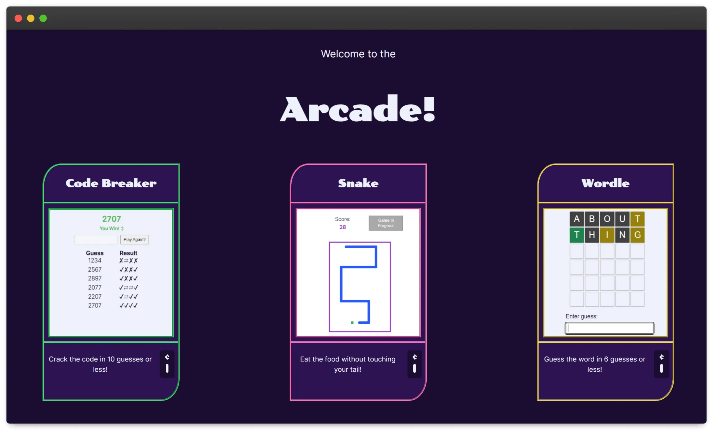
One of my all-time favorite pastimes is playing games. I was starting to collect a few different ones I’ve made during my learning journey, and decided it was time to give them their own home! Now I have a space to show off the games I’ve built and can easily add new games and continue to explore.
Highlights: The Good Parts
- I’ve really been leaning into Astro lately and it’s been a pleasure to build with. It’s a really nice mix of mostly vanilla HTML and JavaScript, with just enough JSX & Astro niceness to make building out templates and passing values to them easy. The extra bonus is that, since my games aren’t all made using the same flavor of JS, I can mix and match that in Astro and get to play with different frameworks and still show them all on the same site!
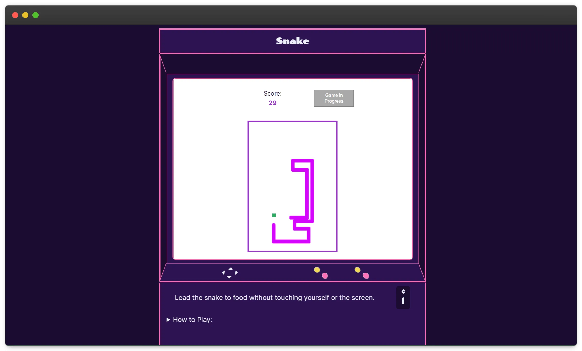
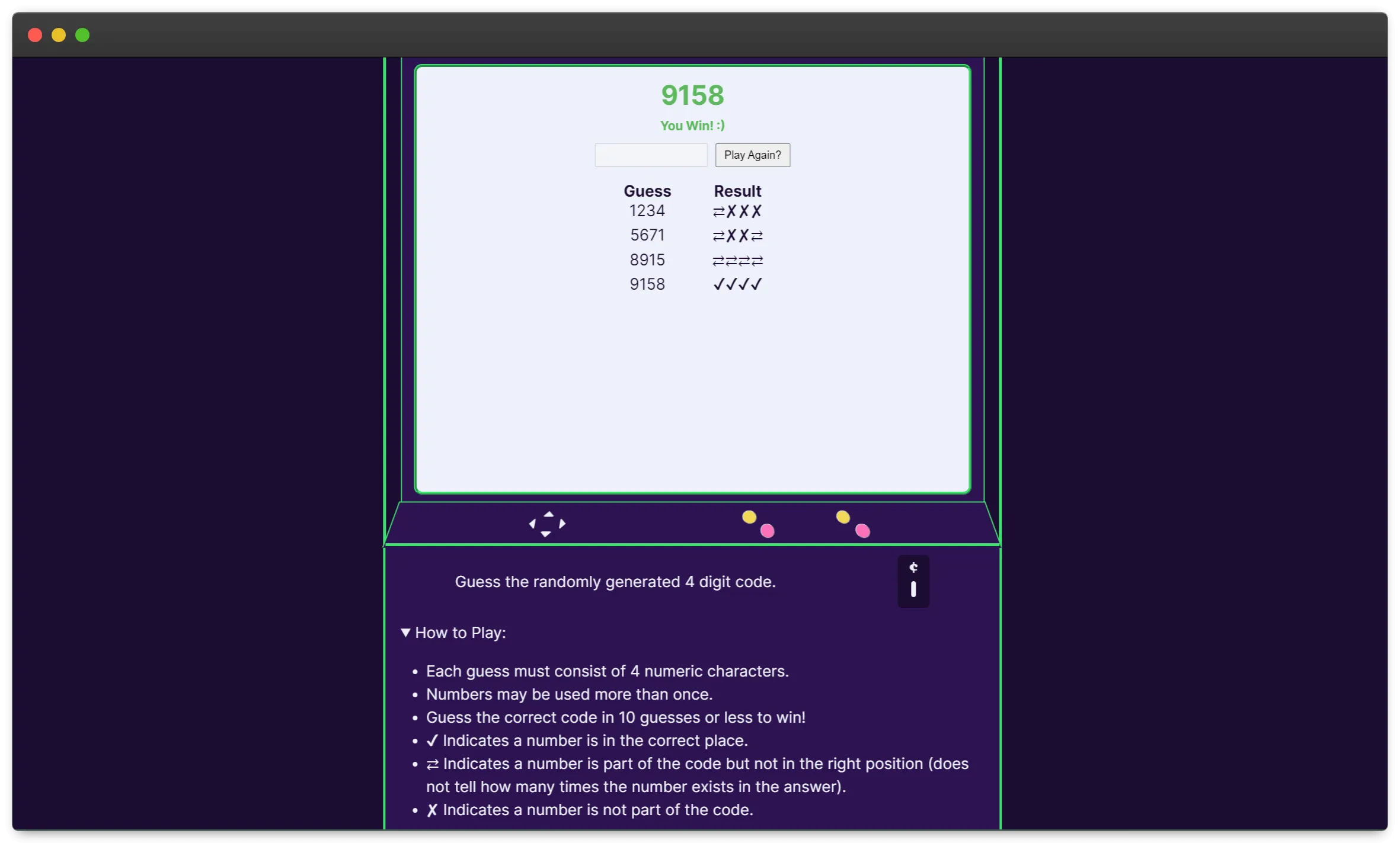
- I didn’t really like the initial design I came up with, so spent some time brainstorming to figure out how I could make it better. I love what I ended up with! It feels fairly simple and sleek on the home page, and I really love the individual game machines themselves. They’re not perfect but it actually feels like an arcade machine. It makes me so happy. This is the part of CSS that I adore - having an idea and being able to break it down into boxes so I can craft it with code.
- Porting my games from their separate repositories into the arcade one was fairly straight forward and pain free. A lot of the HTML and JS “just worked”, or only needed minor tweaks. This was a huge win and made developing the site itself a lot more fun.


Challenges: The Hard Parts
- I initially ran into a few errors with the source code for two of my games, Code Breaker and Snake. Both of these are written using vanilla JavaScript, so had a script tag in their component. It worked great - but if I loaded Code Breaker, I would get an error from the Snake code that it couldn’t find some elements, and vice versa. All the scripts were loading, not just the one for the component I was viewing which is what I expected. Adding the 'is:inline' directive fixed the issue for me here, but it took me a bit to figure that out.
- The biggest challenge was styling. Lol Even though I’m pleased with the end result of my new designs, it took a lot of tinkering and moving things around to get there! It’s still not perfect and feels a little more fragile than I’d prefer. I also ran into multiple issues trying to responsively size things so that they’d show well on mobile devices too, and couldn’t really get this resolved in a way that I’m happy with. With lots of little styling fixes needed for the games to fit into their new screen sizes too, it was just a lot of back and forth in this area.
Takeaway: Lessons Learned
Overall, I’m so excited to have this site live and to start adding more games to it! And I love having a site I can share that has my whole collection.
The biggest takeaways I got from this project were:
- Astro’s going to be a great tool to continue my learning journey, letting me test out different frameworks and showcase those all on the same site.
- This project has also gotten me to dive farther into Astro, actually figuring out times when client directives might be needed. Still a ton more to learn here to really 'get' it, but it’s given me an actual use case for digging in.
Improvements I'd like to make down the road:
- I really want to make the site itself more mobile friendly, and the games as well. This is one of those areas that’s already 90% of the way there, but the remaining 10% is going to take some time.
- I want to upgrade my Snake game. I want to improve on how the snake moves and the collision detection, as well as making it possible to play on mobile (since right now it needs arrow keys to function).